Updated · first published
How do you read a liquidity heatmap?
You read three things: dense zones, where liquidity piles up and slows price; walls that keep refilling, a sign of genuine absorption; and walls that vanish as price approaches, a sign of spoofing. Colour encodes size, the horizontal axis encodes time.
What is DeepDom?
DeepDom is the order-book and heatmap module of DeepCharts. It shows resting liquidity order by order (MBO), refreshed every 0.01 second, with iceberg detection and stop-run detection. It is the tool we use to read liquidity walls before they move.
A heatmap turns the order book into a picture: every resting order, coloured by size, stacked over time. You literally see the liquidity, the walls big players leave, long before price reacts to them. It is the most intuitive way to read order flow, and the least forgiving of lazy reads: everyone sees the wall, few know whether it will hold.
This guide goes from the mechanics to the trade: what the image actually draws, how to tell a real wall from bait, the five behaviours that repeat, a decision funnel and three reference setups, illustrated with official DeepDom captures. To practise as you read, open the free interactive demo in another tab.
What the heatmap draws
Everything starts with the order book (DOM): the list of every resting limit order, ranked by price. Buyers wait below (the bid), sellers wait above (the ask). That book is complete but unreadable: it changes a hundred times a second and says nothing about the history of a level. The heatmap solves exactly that problem. It records the book continuously and paints it: price on the vertical axis, time on the horizontal, and at every level a band whose colour encodes the resting size. One glance replaces an hour of staring at a ladder.
One condition makes the whole read possible: the quality of the data. On aggregated Level 2 you see a total per level, 300 lots, with no idea who makes it up. With MBO data, the book streamed order by order, you see each order appear, move, cancel or reload. Icebergs and pulls simply do not exist in aggregated data, and they are precisely what this guide teaches you to read. The full data ladder is explained in the order flow guide.
Reading the image: axes, colours, scale
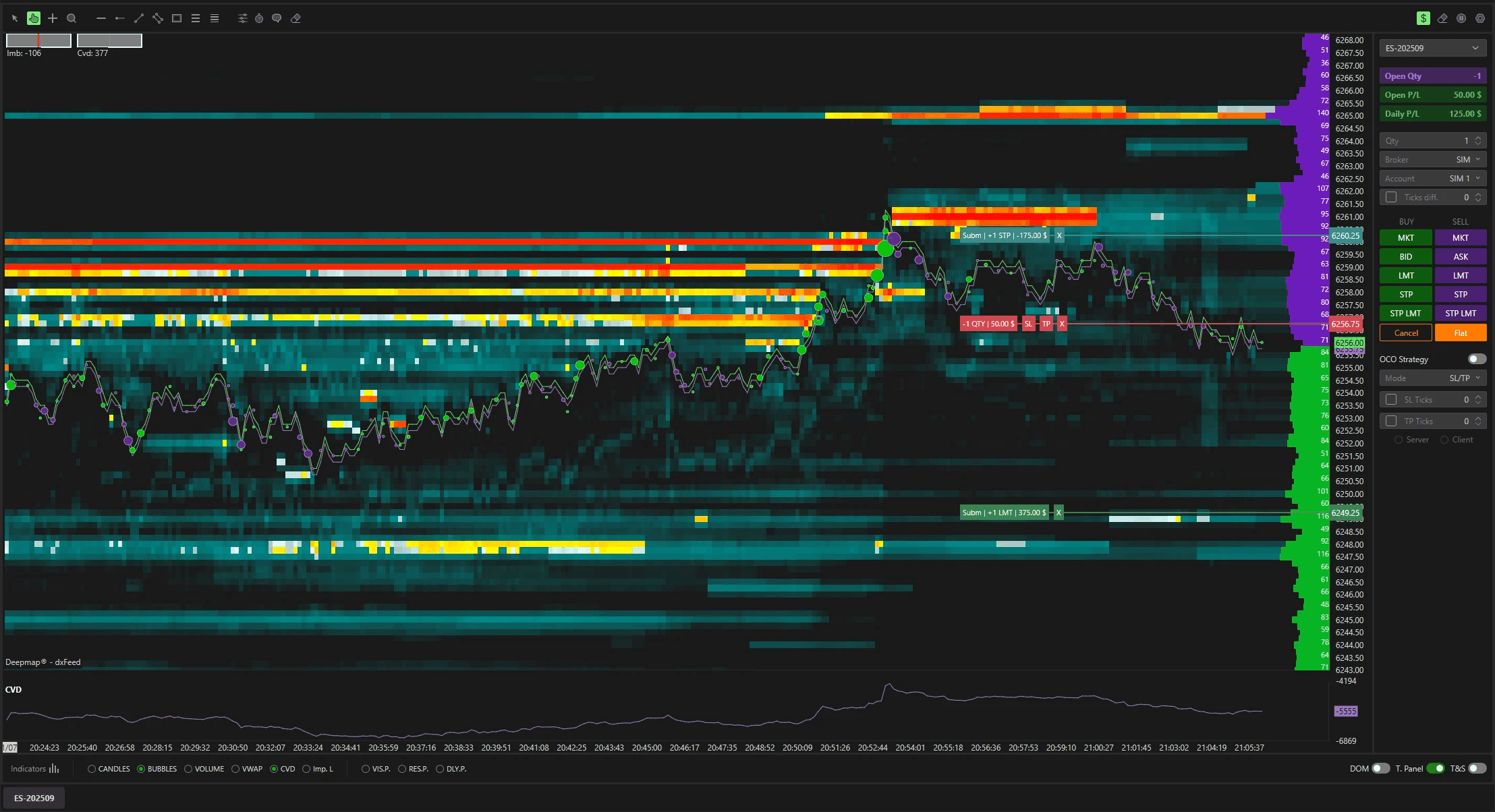
In DeepDom's default palette, the scale runs from dark to bright: deep blue for ordinary liquidity, white then yellow as size grows, orange and red for unusual concentrations. The scale recalibrates automatically on the largest order in view, so your eye is always drawn to what matters most right now. On the right edge, the live ladder shows the current book: bid sizes on one side, ask sizes on the other, so the painted history and the present state read together.
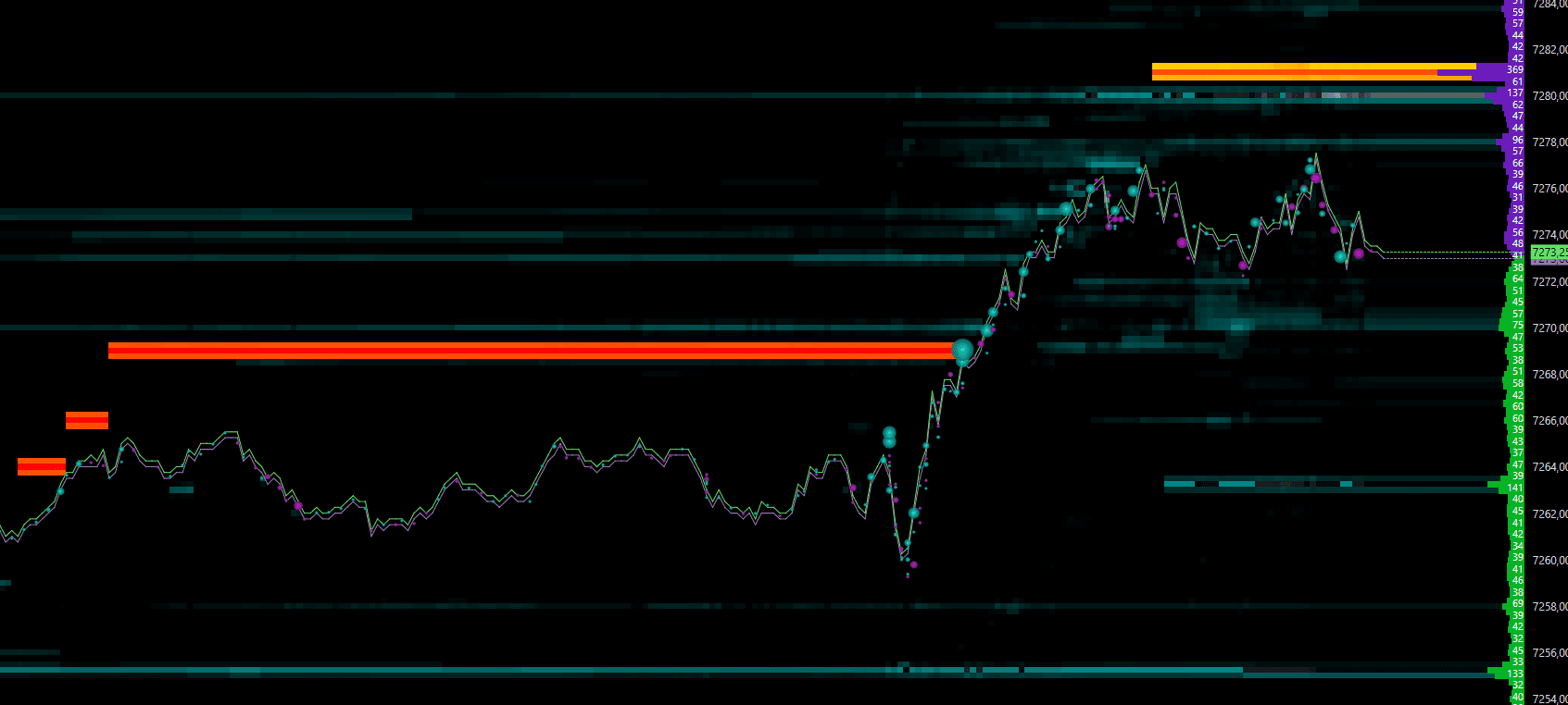
Three zones structure every read. Dense bands brake price: the market must consume them to get through. Empty zones, the dark ones, are corridors: nothing to eat, so price crosses them fast, which is exactly what the capture above shows once the red wall gives way. And walls, the thick bright bands, are decision points: everything the rest of this guide covers happens there.
Walls: size, age, behaviour
A wall is a concentration of resting orders big enough to brake price. Three attributes decide its value. Its size: the thicker and brighter the band, the heavier it is. Its age: a level that has held for an hour engages its owner far more than one posted a minute ago. And above all its behaviour on contact, because size is free to display and only execution is real. A wall that takes aggression and holds is absorption. A wall that vanishes as price approaches was bait.
This is why the read is made over time and never as a snapshot. A screenshot shows a wall; only the live map shows whether it reloads after each hit, moves away tick by tick, or thins out under real consumption. The three stories end differently, and only one of them deserves your stop behind it.
Fresh vs persistent liquidity
This is the distinction that separates a beginner from an order flow reader. Fresh liquidity just appeared. It signals new intent, but it can be pulled at any moment, and a sudden apparition right as price approaches is often reactive or defensive: caution. A persistent order has been sitting for a long time, never cancelled despite the market moving around it: someone truly believes in that level and defends it. The reaction there is far more probable and far more durable.
Mark the level and watch it: the older it is, the more committed its owner.
Caution: it can be pulled before price even touches it. Watch its behaviour first.
Patient players and new ones at the same price: the premium combination, strong expected reaction.
The 5 behaviours to recognise
Big players cannot buy thousands of contracts at once without moving the market against themselves. So they hide, absorb, and sometimes deceive. Everything you will ever read on a heatmap comes down to five behaviours. For each one: what you see, and the right reflex.
What you see: A wall takes a wave of aggressive orders without giving way: volume explodes, the band stays, price stops advancing.
The right reflex: Whoever absorbs is in control. Wait for the aggressors to exhaust, then play the move back in the wall's direction, stop behind it.
What you see: The book shows 20 lots, hundreds execute at the same price and the level holds: the visible slice reloads after every fill.
The right reflex: An iceberg defends a price with real money. As long as it reloads, never trade against it: get on its side of the market.
What you see: A huge band appears, impresses everyone, then cancels just before contact: it never intended to be filled.
The right reflex: A pull as price approaches invalidates the level: stop treating it as support or resistance. Repeated, it is spoofing, the exact opposite of absorption.
What you see: A fast push crosses an empty zone of the heatmap, beyond an obvious low or high, triggers the stops then snaps straight back.
The right reflex: The sweep supplies the liquidity of the big player entering the other way. Don't anticipate it: wait for the re-entry into the range, it often precedes the real move.
What you see: The wall thins tick after tick, from red to orange then yellow, while aggression keeps its size and CVD pushes in the direction of the break.
The right reflex: A wall consumed progressively is a real break, a wall that disappears at once is a pull. Beyond it, the empty zone acts as an accelerator: target the next wall.
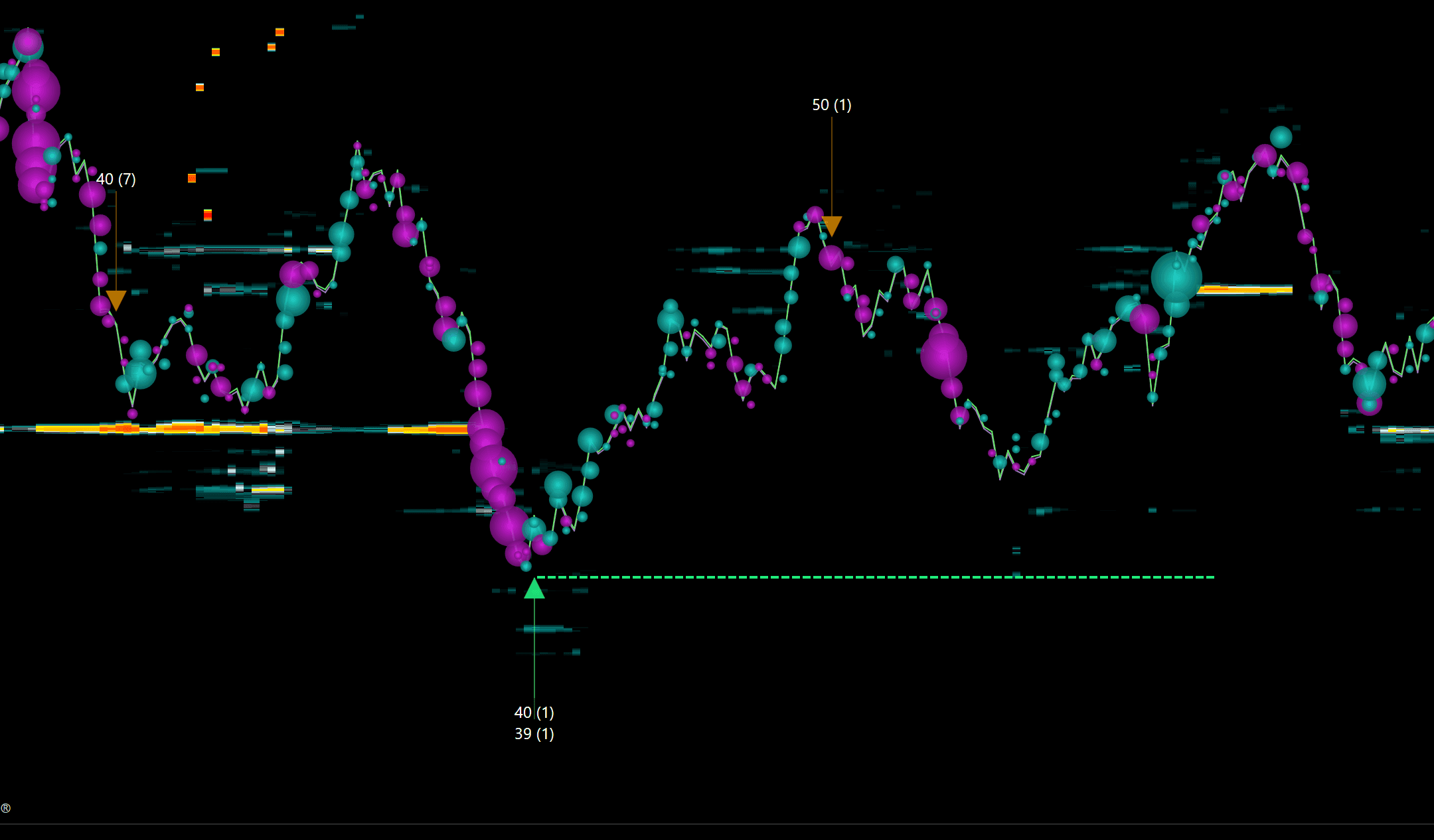
The point of MBO tooling is that these behaviours stop being a matter of interpretation. Above, the Iceberg Detector stamps each reload on the chart with its detected size and extends the defended level. DeepDom does the same for stop runs, and its Deep Wall detector, rare by design, fires when a passive wall on the ES rejects aggression outright, which frequently betrays a hidden iceberg.
What is spoofing in trading?
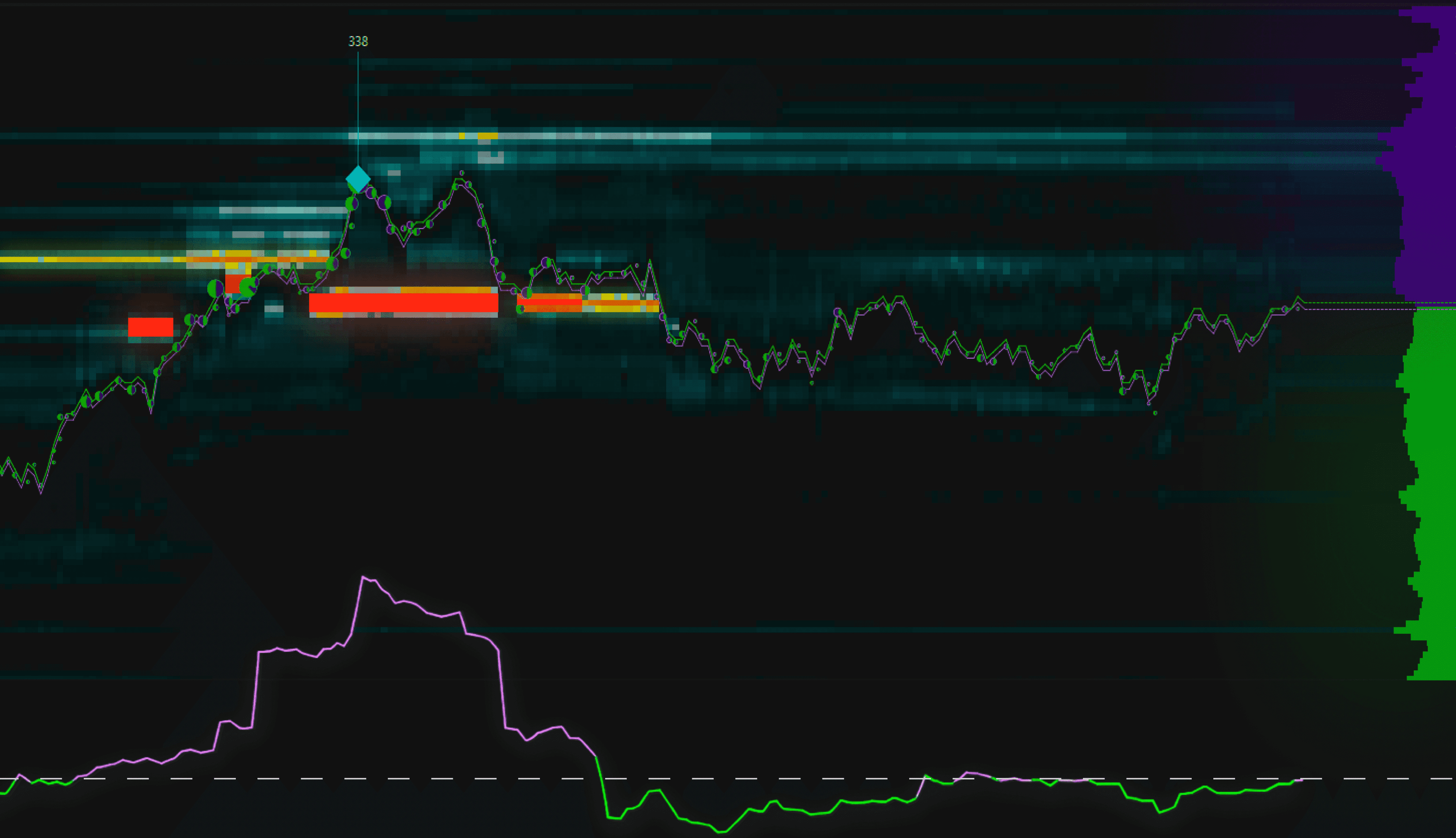
Spoofing means posting large orders with no intention of executing them, to fake pressure, then canceling as price approaches. The practice is banned on regulated markets. On an MBO heatmap, a wall that repeatedly vanishes as price gets close betrays that behavior: the opposite of genuine absorption.
What is a stop run (stop hunt)?
A stop run is a fast push into a zone where stops cluster, below an obvious low, above a high, to trigger their execution and take the liquidity. Price often snaps straight back into the range. On the heatmap, the targeted zone shows up as the liquidity resting around those levels.
Cross it with aggression: bubbles, delta, CVD
The heatmap only shows half the market: the orders that wait. The other half is the orders that hit. DeepDom prints every market execution as a bubble at the exact price and moment, sized by quantity: small scattered bubbles are noise, clusters of large ones mean a serious player is executing. The footprint, the delta and the cumulative delta (CVD) aggregate the same aggression in other forms.
The two lenses only make sense together. A wall without aggression against it is a hypothesis. Aggression without a wall in front of it is a corridor. And their combinations are the actual signals: massive volume into a band that refuses to move is absorption; shrinking bubbles as price advances is exhaustion; a new price high without a new CVD high says the rally is empty. Add the volume profile and the VWAP for context, both drawn directly on the DeepDom chart.
The decision funnel
No layer trades on its own. A signal is worth the number of independent reads that align on it. The funnel goes from wide context to precise trigger, and if a step is missing you do not go down to the next one:
- 1Context
A persistent wall on the heatmap defines the zone. No zone, no trade.
- 2Validation
The liquidity is real: it holds, reloads or absorbs. A pull kills the idea on the spot.
- 3Trigger
Aggression turns: exhaustion of the attacking side, or a cluster in your direction.
- 4Confirmation
Delta and CVD agree, ideally with a divergence in your favour at the level.
- 5Entry
At the zone, stop behind the structure that carries the thesis, target on real liquidity.
Three reference setups
Three recurring configurations, from the simplest to the most demanding. Entry, stop and target are principles to adapt to the instrument and the volatility, not recipes. The free courses walk through each one with annotated sessions.
A buy wall has held below price for a long time. Price returns, sellers hit it, the band reloads and sell executions shrink.
At the wall, as soon as seller exhaustion shows.
A few ticks behind the wall: if it gives way, the thesis is dead.
The next liquidity band above, the POC or the VWAP.
⚠ Invalid if the wall pulls as price approaches: a pull is not support.
An aggressive impulse hits a large wall that takes everything: huge volume, flat price. When aggression exhausts, price leaves in the absorber's direction.
On the first rejection, once aggressor exhaustion is visible.
On the other side of the absorbing wall: beyond it, absorption failed.
2 to 3 times the risk, or the zone the impulse came from.
⚠ Demand confluence: visible absorption, CVD divergence, a profile or VWAP level.
Price sweeps an obvious level through an empty zone of the heatmap, triggers the stops, finds no liquidity on the other side and reverses hard.
When price re-enters the range, after the sweep and the reabsorption.
Beyond the extreme of the sweep's wick.
The opposite liquidity, often where the adverse stops cluster.
⚠ Never anticipate the sweep: entering early means being the hunted liquidity yourself.
Common to all three: the stop hides behind the liquidity that carries the thesis, never at a round number, and the target is a real liquidity zone, never an arbitrary figure. Risk management does the rest: 1% maximum per idea, a minimum of 2R, and a daily loss limit you actually respect.
The DeepDom workspace
Everything described so far is what DeepCharts' DeepDom module renders: the MBO heatmap refreshed every 0.01 second, execution bubbles, iceberg and stop run detection, with a book read that goes deep into the ladder while staying light on the CPU. Around the map, the workspace adds the advanced DOM and its analysis columns, the time and sales, the volume profile, delta and CVD.
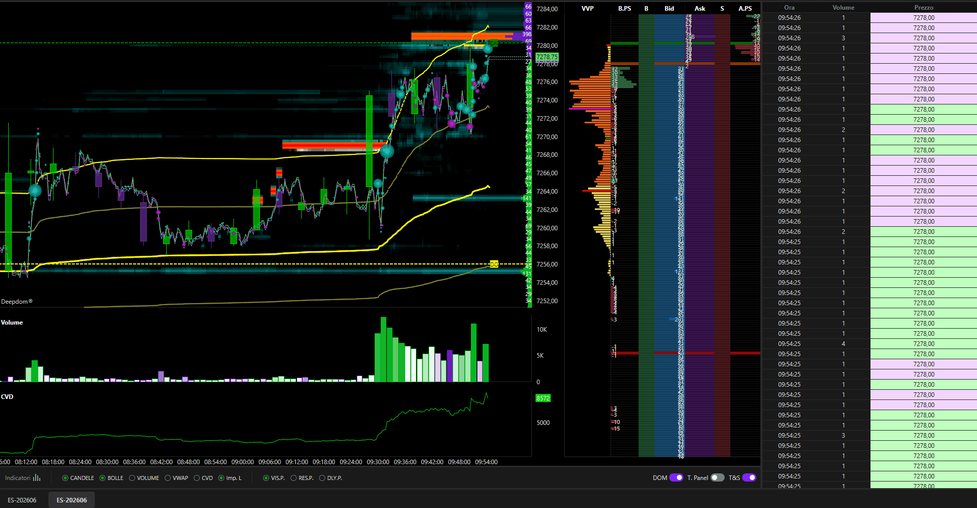
The advanced DOM columns worth learning first:
| Column | What it teaches you |
|---|---|
| Bid / Ask | Resting limit orders on each side, level by level: demand below price, offer above. |
| VP | The session's volume profile, glued to the ladder: the prices where the market actually traded. |
| B.PS / A.PS | Pull and Stack: what was just added or removed at each level. The column that unmasks a wall fleeing before contact. |
| BT / AT | Volume executed at market on the sell and buy side: real aggression, to compare with the size displayed in the book. |
| Offers | The number of orders making up each level: one 300 lot order does not mean the same thing as fifty orders of 6. |
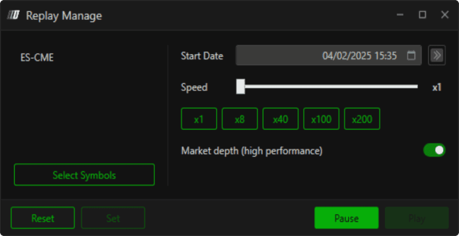
Execution happens in the same window: orders are placed and dragged directly on the heatmap, with an OCO bracket attaching the stop and the target to the entry, on a live or a SIM account. And the replay engine re-runs any past session tick by tick, book depth included, from x1 to x200: the fastest way to train the read without risking anything.
Budget wise, count three items: the platform license, up to 25% off with code OFF, the base data feed, dxFeed from $19/month, and the MBO depth billed by the exchange, $39/month on the CME and +$65/month for Eurex, rare on the FDAX and one of the reasons we work on this platform. Indicative pricing, detailed on the DeepCharts page.
The traps that cost money
Displayed size costs nothing to whoever posts it. Only behaviour counts: a wall that holds and reloads is real, a wall that flees is bait.
A wall that appeared ten seconds ago is not worth a wall that has held for an hour. That confusion is what walks you into every spoof.
The stop right under the obvious low, the entry right at the level everyone sees: if the setup is obvious, ask yourself who wants you to see it.
A big band without execution confirmation is only a hypothesis. Without the aggression against it, you are trading a picture, not a market.
The stop goes where the thesis becomes wrong, behind the wall that carries it, never at an arbitrary distance nor at the round number where everyone's stops sleep.
On a CPI or FOMC print, the book empties and pulls explode: the heatmap means nothing for several minutes. Stay flat and watch.
Trade it on a funded account
Several order-flow prop firms bundle DeepCharts so you can trade the heatmap with their capital: pass the evaluation, respect the drawdown, keep a share of the profits. Compare rules and platforms in the comparator. One caveat worth knowing: the build a prop firm bundles does not unlock the full indicator set, so for the complete read you will want your own license.
FAQ
What is a heatmap in trading?+
A trading heatmap is a live map of resting liquidity: buy and sell limit orders coloured by size, stacked over time. It shows where large orders sit before they act, so you can anticipate where price will react.
How do you read a heatmap?+
Bright bands are large resting orders (liquidity walls). Watch how they behave: a wall that absorbs aggression caps price; a wall that vanishes as price approaches is often spoofing; empty zones let price accelerate to the next wall.
Heatmap vs footprint: what's the difference?+
The heatmap shows resting (passive) liquidity in the order book over time. The footprint shows executed (aggressive) volume, buy vs sell, per price. One anticipates where price may react, the other confirms what happens there.
What data does a reliable heatmap need?+
MBO data, the book streamed order by order. On aggregated Level 2 you cannot see icebergs reloading or orders being pulled, which is precisely what the read is about. The exchange bills that depth: about $39/month on the CME, around $65/month for Eurex.
What software shows a liquidity heatmap?+
Few tools read the book order by order: Bookmap, Sierra Chart with the right module, Quantower and DeepCharts, whose DeepDom module refreshes every 0.01 second. Several prop firms also bundle DeepCharts into their evaluations.
Fresh vs persistent liquidity: what's the difference?+
A fresh order just appeared and can be pulled at any moment; a persistent order has held for a long time despite the market moving, so someone truly defends that level. The read weighs a wall's age as much as its size.
How much does a complete heatmap setup cost?+
Three items: the platform license (up to 25% off with code OFF at DeepCharts), the data feed (dxFeed from $19/month) and the MBO depth ($39/month for CME, +$65/month for Eurex). Indicative pricing for a professional tool.
Can I practise reading a heatmap for free?+
Yes. Our free interactive demo simulates walls, icebergs, spoofing and stop runs. And DeepDom's tick-by-tick replay lets you re-run real past sessions, book depth included, without risking anything.
Want to get better at order flow?
We discuss flow, liquidity and our trades live, every day, on the OrderFlowFutures Discord. Join us, it's free.
Join the Discord for free7 online·38 members·Free · instant access